I’m Kopis. Design Refined
A New Theme as Bold as Sabre’s New Identity
Built on the proven Spark v3 foundation, Kopis isn’t just an update—it’s a transformation. It brings Sabre’s bold new brand to life with a look that’s sharp, modern, and ready for what’s next:
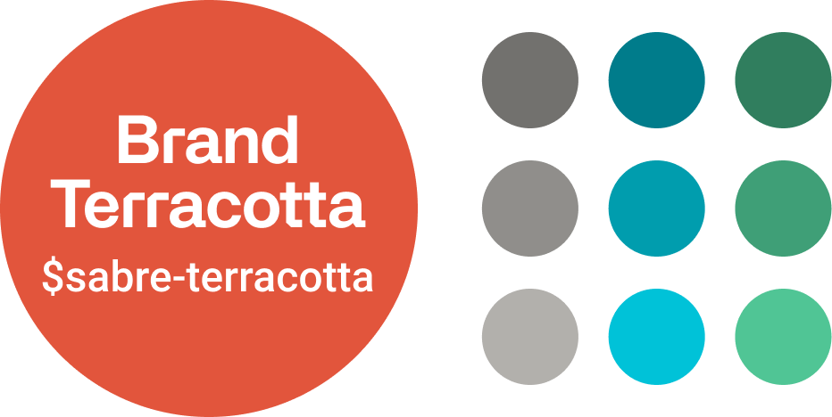
New Colors
We’ve crafted a color palette that fits harmoniously with our new brand colors, while sticking with the same usability principles that made the previous Spark theme strong. If you use Katana today, you can simply remap the new color steps to the old ones.
Galeria
New Brand Font
Introducing Sabre’s new APK Galeria font, for use in Product Name labels and headers from H1 to H4. While stylish, its open letters and medium font-weight also help with readability.
Clean Lines. Sharper Corners.
We’ve tightened the border-radius from 12px to 4px, because precision speaks volumes. It’s clean. It’s sleek. It’s minimal. It’s the kind of design that feels fresh and moves fast.
This isn’t just a tweak—it’s a statement. A polished interface that aligns with our new brand and the design principles shaping the future. Flat. Minimal. Professional.
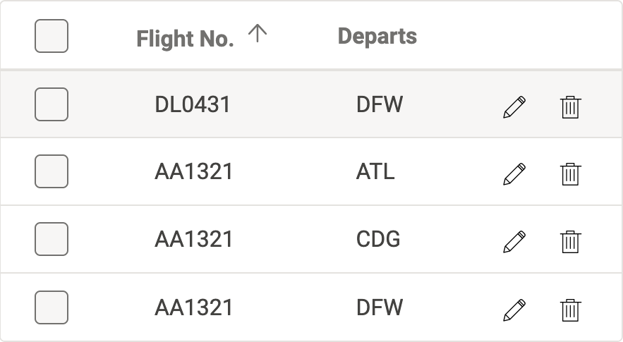

No More UPPERCASE
Title-Case reduces cognitive load and makes reading smoother, so we’ve updated our components:
- Button labels
- Category headers
- Tab labels
- Toolbar labels
New Theme, Same Code
If the code looks familiar, that’s because it hasn’t changed! We’ve created a new stylesheet/theme for Kopis on top of existing v3 code, resulting in an easier transition for product teams already using Spark.
<div class="spark-accordion">
<section class="spark-accordion__drawer">
<header class="spark-accordion__header" tabindex="0" aria-controls="example--unique-drawer-id" aria-expanded="false">...</header>
<div class="spark-accordion__content" id="example--unique-drawer-id">...</div>
</section>
</div>